
Brand Guides: What Are They and Why You Need One
So, you just finished refreshing your logo. Congratulations! I bet you can’t wait to finally share your new look with the world. But before you do, have you thought about what can happen once your logo leaves the office? Just because the file you have saved is set up perfectly, doesn’t mean that it can’t and won’t be adjusted by someone else. From colors to sizes and everything in between, once your logo leaves your hands, it can be manipulated in a number of ways. That’s why it’s important to go one step further and create a brand guide.
What is a brand guide?
Why do you need one?
1. To Create Consistency
2. To Ensure Brand Quality
3. To Deter Unwanted Design Modifications
What all goes into a brand guide?
Logo Usage
- logo variations and icons
- logo colors and how they should be applied to different backgrounds
- logo font(s)
- size (minimum recommendation)
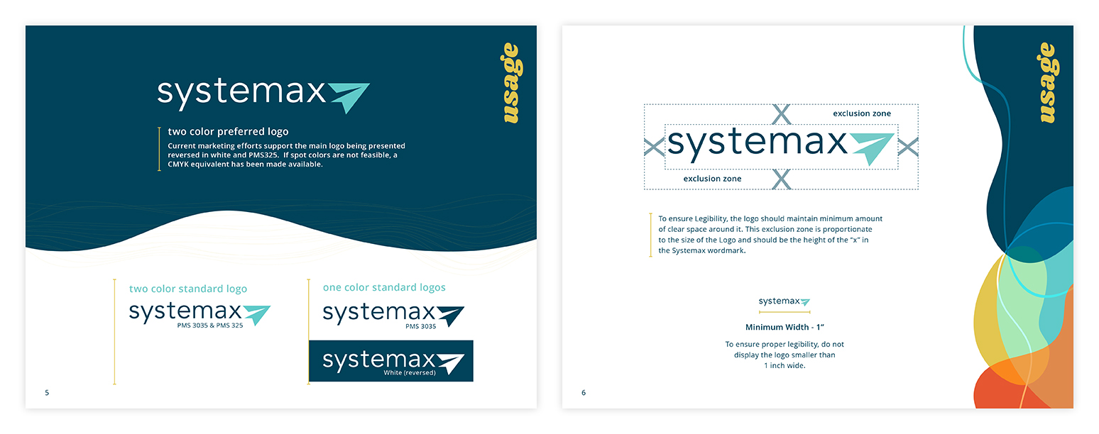
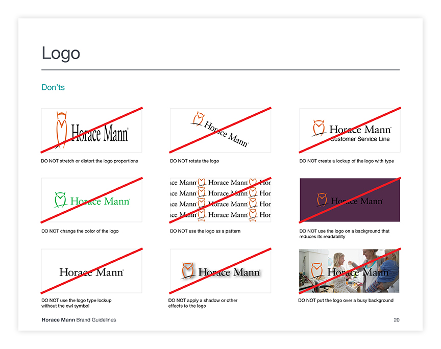
You may also feel the need to include a section that shows how NOT to use your logo.
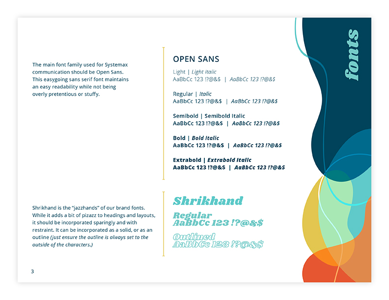
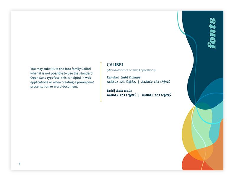
Fonts
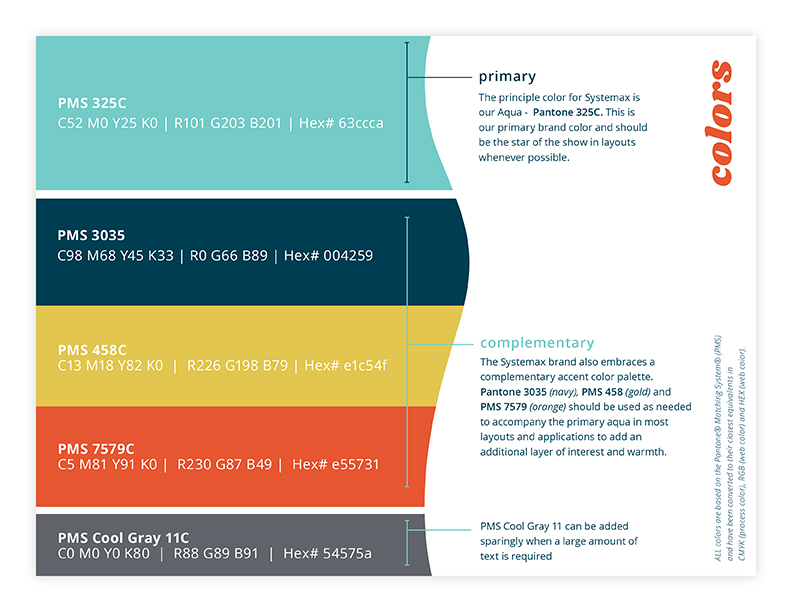
Colors
- Primary and secondary colors
- PMS Colors (Pantone Matching System)
- CMYK values (4-color printing)
- RGB values (web and other digital applications)
Additional Sections
- History
- Mission & Values
- Voice & Tone
- Photo Guidelines
- Apparel Guidelines
- Icons & Other Graphics
 Author Info
Hello! My name is Kaitlyn and I am one of the Graphic Designers here at Systemax. Every day, I work hand in hand with our team to develop designs that not only look great, but meet our client’s needs and help push them toward their goals. Outside of work, you can find me with my family and friends, scrolling the web for new design tricks and inspiration, or messing around with my camera.