Popular Logos and How They Have Transformed Over Time
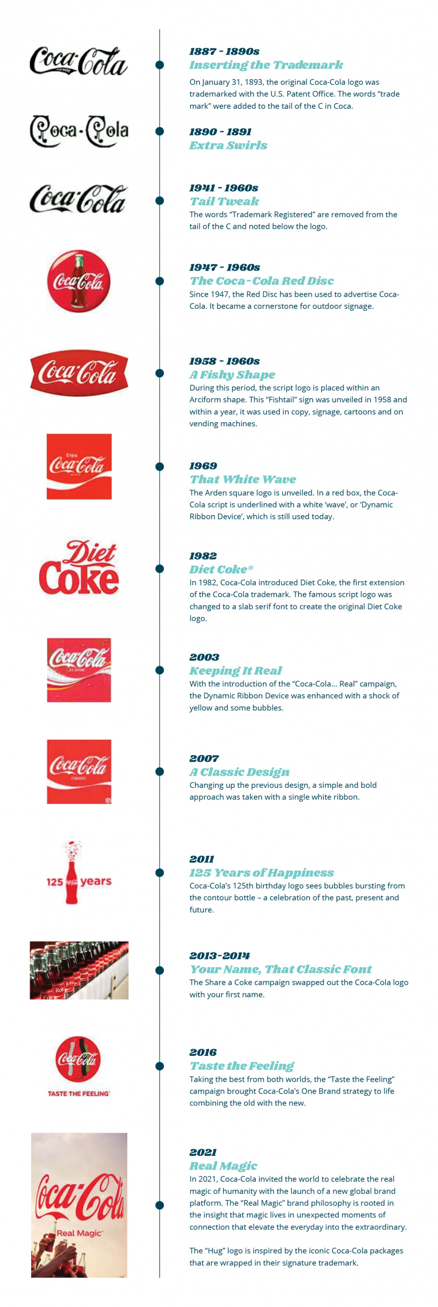
Ah, logos. The cornerstone of a company’s brand identity. They can be so iconic and memorable, but have you ever looked at one of your favorite brands, and wondered, “Has the logo always looked like this?” The truth is no. Logos grow and change over time just like everything else. Sometimes, the changes are subtle and go unnoticed by the public, while others receive complete and drastic overhauls. Let’s take a look at a couple of popular brands and see just how much (or how little) their logos have transformed over time.
Source: https://www.coca-colacompany.com/au/news/trace-the-130-year-evolution-of-the-coca-cola-logohttps://www.coca-colacompany.com/news/coca-cola-launches-real-magic-brand-platform-including-refreshed-visual-identity-and-global-campaign
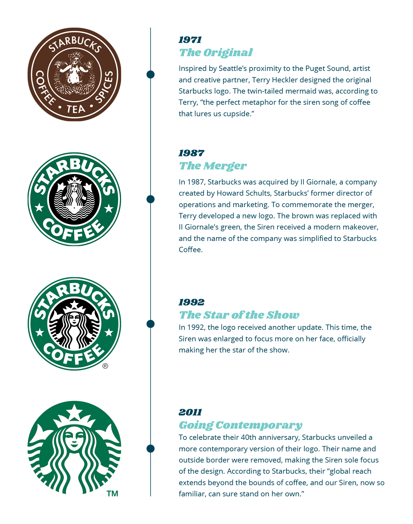
Since its inception in 1971, the Starbucks logo has undergone its fair share of changes. However, through every iteration, one thing has always remained the same, the Siren. As you can see, she has continued to be the focus of every Starbucks logo.
As Starbucks has continued to grow over the years, so has its logo. The idea that produced the original 1971 logo is still very much relevant today. However, the current logo is equipped to handle a more modern world where the Siren can clearly stand on her own.
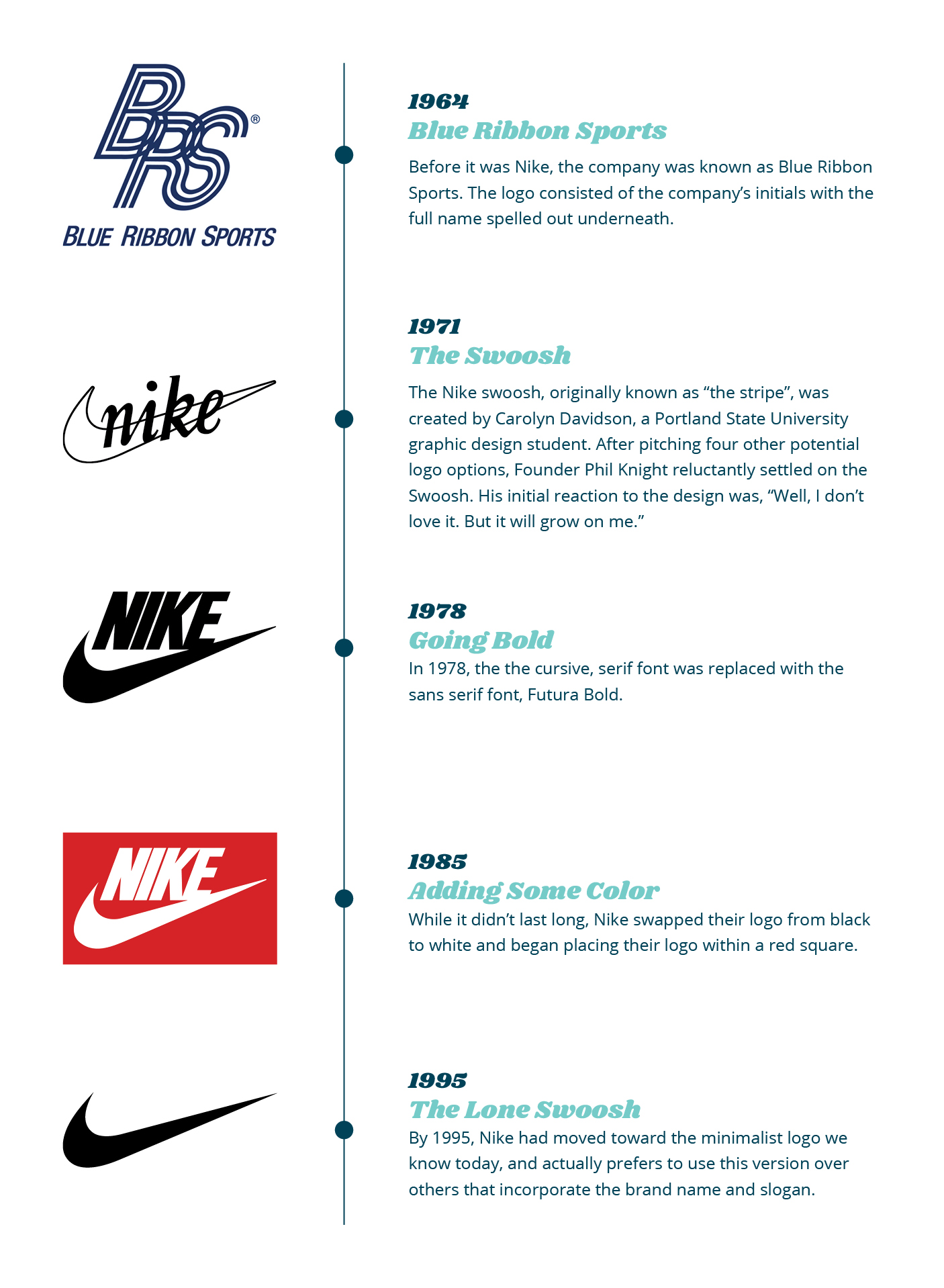
In the world of sports, there are few logos quite as iconic as that of Nike. In fact, the simple Swoosh is so well known that the company will often drop its name entirely. However, it took some time for the logo to get to this point. As you can see below, the Nike logo went through a couple of iterations before settling on the minimal version, we’ve come to know and love.
Author Info
Hello! My name is Kaitlyn and I am one of the Graphic Designers here at Systemax. Every day, I work hand in hand with our team to develop designs that not only look great, but meet our client’s needs and help push them toward their goals. Outside of work, you can find me with my family and friends, scrolling the web for new design tricks and inspiration, or messing around with my camera.

