
Print Production: Things to Consider and How to Stay on Your Printer’s Good Side
Have you ever been tasked with submitting a file to a printer? At first, it may sound pretty simple. Just create a new document, add in some text, and hit send, right? Wrong. When it comes to setting up design files for production, there are a variety of factors to consider and if your files are not set up correctly, you’ll be sure to hear about it from your printer. So let’s talk production, things to consider, and how to make sure you stay on your printer’s good side.
Understand the Medium
Before you start designing anything, you need to have a good understanding of what the piece is and how it will be used. Artwork created for use on ATM receipts will be completely different from that of a direct mail piece. Each one has its own set of requirements. For example, on a direct mail piece, the type of postage you choose can limit the size of your piece. It can also dictate which areas you are free to design in and others that need to be left open for barcodes, postage, etc.
Know Your Colors
The type of piece you are creating can also determine what colors you can use. Some items, like ATM receipts and envelopes, may require you to set up your artwork using Pantone colors. In this case, it is important to double-check that the colors you choose are in fact Pantone colors and not CMYK swatches in disguise.
Check the Resolution
Okay, so this one may not be something that your printer will check, but it is something that you definitely should. Before submitting any artwork, be sure to check the resolution of all of your images. This can be done in Illustrator by clicking on an image and then opening the links panel.
![]()
A variety of information will be listed out for you, but the thing you should look at is the PPI, short for pixels per inch. This number represents the number of pixels contained within one inch of an image displayed on your screen.
![]()
When it comes to print items, such as posters, envelopes, postcards, etc., images should be at least 300 PPI or higher. Any lower and you risk your image becoming pixelized or blurry. To understand why this is so, click here (insert link to Bitmap vs. Vector blog).
If you work in InDesign, this information can be found the same way. Simply click on your image and open the links panel.
Actual PPI is the resolution of the image at its original size while the effective PPI is the resolution of the image at the size to which it has been scaled within InDesign. This is the number you need to pay close attention to. As you shrink and enlarge an image within either program, it affects the resolution and the final PPI.
If you find that your image falls below 300 PPI after it has been placed and scaled within your piece, you have a few options.
- If you found and purchased your image from a stock site such as iStock, check to see if they have a higher resolution image available.
- Check with your printer. Sometimes images that fall slightly below 300, but above 200, do not see the same issues as an image under 200 PPI. It doesn’t hurt to ask as they may find your image is fine to print as is.
- Find a different image. Now I know this can be tough because when you find the perfect image, you find the perfect image and no one can tell you otherwise but hear me out. There are a ton of stock websites out there. Some you have to pay for, but there are others that provide FREE high-resolution images so why not take a look. As crazy as it sounds, you might find an even better image.
Don’t Forget the Bleeds
When it comes to printing, some people like to have a white border around their artwork and others don’t. If you’re someone who prefers the latter, then be sure to add bleeds to your files. Bleeds are the extension of an image, shape or color beyond the edge of your page, usually by 1/8″.
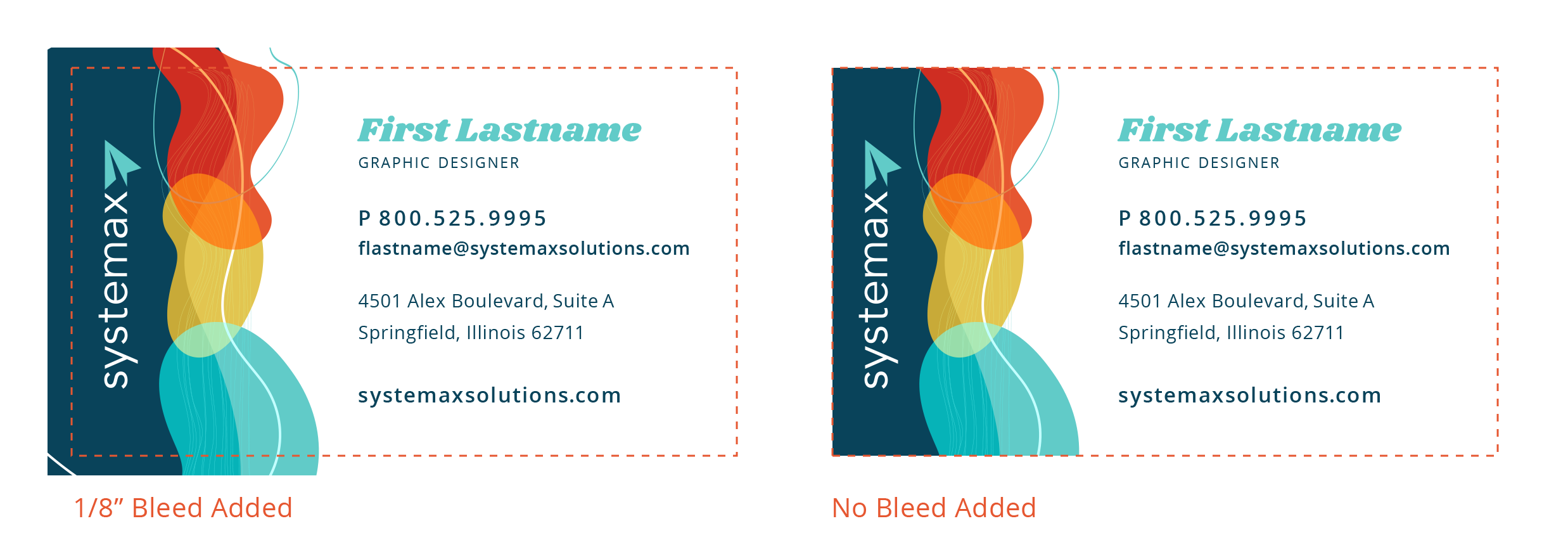
The reason bleeds are so important has to do with the printing process. Let’s say you are printing a poster and you DO NOT add any bleed. Once your poster is printed, it then needs to be cut. While technology has come a long way, there is always the chance for error. If not cut precisely along the edge, a thin, white strip will show along the sides of your poster. However, if bleeds had been added, it would have given the printer room to guarantee that those white strips do not appear, leaving your piece looking exactly how you wanted it to.
When it comes to setting up a file for print, there can be a lot to consider. However, it is important to remember that by preparing your documents correctly at the start, you’ll not only make things easier for the printer but prevent a potential delay in the production process. If anything about the setup process seems overwhelming or confusing, reach out! I or another designer would be more than willing to check your artwork for issues and let you know how to correct them.

Author Info
Hello! My name is Kaitlyn and I am one of the Graphic Designers here at Systemax. Every day, I work hand in hand with our team to develop designs that not only look great, but meet our client’s needs and help push them toward their goals. Outside of work, you can find me with my family and friends, scrolling the web for new design tricks and inspiration, or messing around with my camera.