
Color Psychology: What is it and how do colors affect us?
When you see a color, what comes to your mind? How does the color make you feel? These questions are very important when it comes to the psychology of color.
Colors are a lot more than their visual appearance and hue. Different colors have different meanings, connotations, and psychological effects. The way we are affected by colors may depend on our cultural and personal background. Let’s jump into talking about color psychology!
What is Color Psychology?
Color psychology is an area of research that looks at how color influences our behavior and decision-making.
Color psychology is heavily used in marketing to persuade and catch the eye of the consumer. Digital Synopsis states that 93% of buyers focus on a product’s visual appearance. 84% of buyers claim that color is the primary reason for buying.
Besides products, colors can also impact the way that buyers perceive a brand.
Let’s run through the basic colors and talk about how each makes us feel and how they are often used in branding and everyday life.
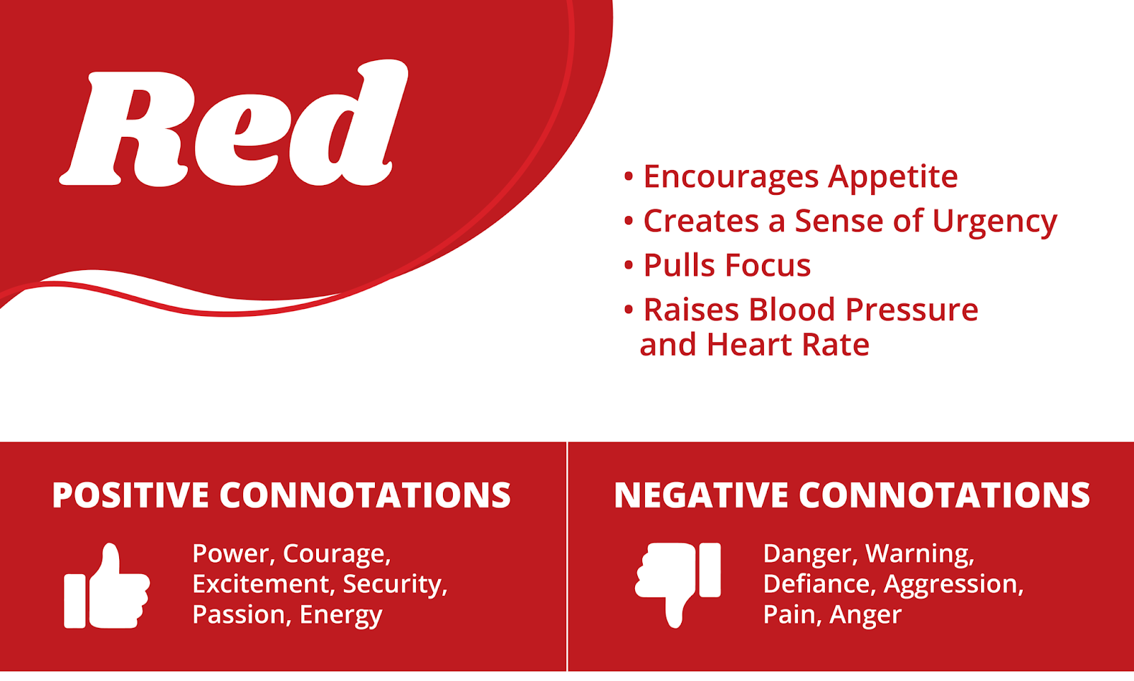
Red is a powerful color that holds the personality of being adventurous and energetic. It can evoke an array of emotions right away, like excitement and danger.
You can see the color red on a daily basis from stop signs on the road to apples in your kitchen. Red is also used in many well-known brands like Netflix, Kellogg’s, Target, and Coca-Cola.
Red works great for food industries since it often encourages appetite. When you walk into a restaurant you will often see red or warm décor, menus including red, and even red branding most of the time. Think of McDonald’s, Arby’s, Chick-fil-a, Pizza Hut… they all have red prominent branding.
Red also creates a sense of urgency and pulls focus. This is why you will often see red used to promote sales with clearance signs and “call to action” buttons.
You have to be careful with red, though. Mostly it is perceived with negative connotations like danger and warning. If you are using it in marketing pieces, make sure to use positive descriptive words to give the red a positive connotation instead of a negative one.
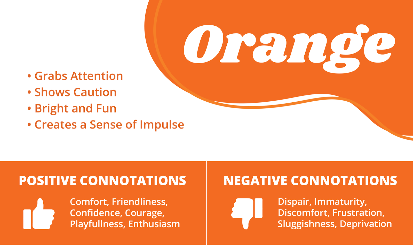
Orange also has the personality of being adventurous along with being competitive. When you first see orange you might feel enthusiastic, energetic, and cautious.
You often see orange on construction sights and in brands like Amazon, Nickelodeon, and Harley Davidson.
When I think of orange I always think about construction sites. It works best there because it grabs your attention and alerts caution. This is why many road signs by construction zones and traffic cones are orange. When you see that color, it makes you cautious to know something is ahead.
Since it is a bright, fun color many brands use it to seem playful and friendly. But, also has tendencies of coming across as “cheap”. Be careful where you use it and how often you use it!
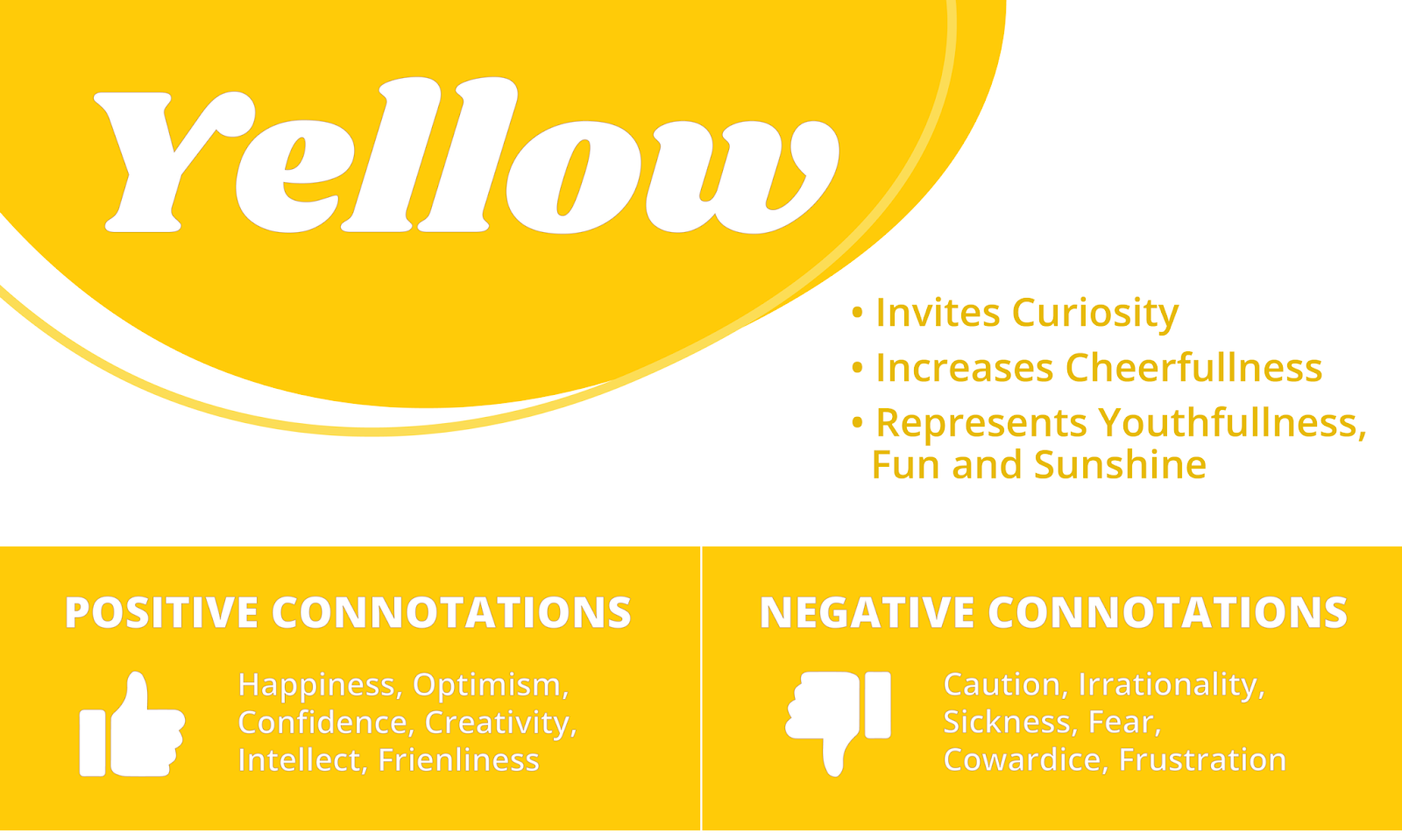
It’s hard not to see yellow and not think of sunshine and happiness. It’s actually known as one of the happiest colors in color psychology. It represents youthfulness and fun… I mean, you can’t be mad looking at the color yellow.
Although it’s a very happy color, it can also represent danger and caution. I know we have all seen the yellow triangle with the exclamation point inside of it. You’ll see this as a sign of warning whether you are on your computer or on the road.
Brands will use yellow to come off as more playful and vibrant. But you want to make sure you are using yellow sparingly. If yellow is used too frequently, it can create anxiety and become overwhelming.
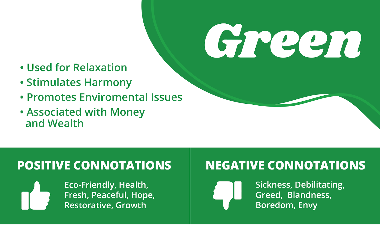
Green is the color most associated with nature. It’s the color of grass, trees, and plants. It gives the feeling of peace, friendliness, and openness, but also greed and envy.
One of the main uses of the color green is for relaxation. If a brand wants to come off as chill, they will use green throughout their brand and their physical establishment. You will also see green as a calming effect in doctor’s offices and most spas.
Green is almost always used to promote environmental issues and is associated with natural and eco- friendly products or services. The saying “Go Green” has really solidified that the environment and the color green go together.
You will also see green used in financial institutions because it also is associated with money and wealth. This is why many banks use the color green in their branding and materials.
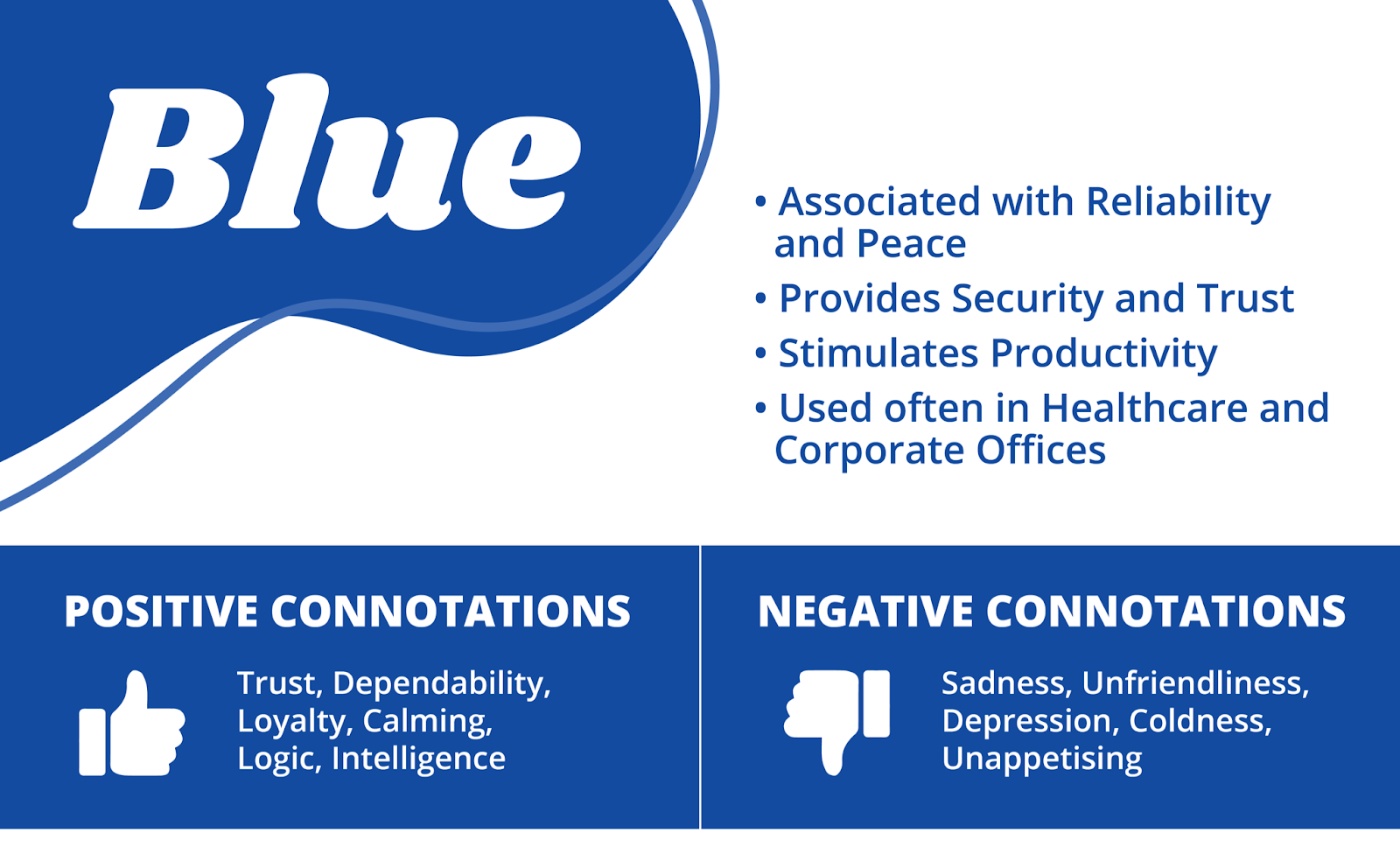
Blue holds a very wide range of emotions. From trust, calming and intelligence to depression and unfriendliness, blue can be associated with a lot of different emotions. It’s also the color associated with strength, wisdom, and respect. Since blue is so diverse, it is used widely in many different types of brands.
Blue provides a sense of security, trust, and reliability. Because of this many offices, corporate brands, and technology companies will use blue in their branding. For example: Dell, Samsung, Visa, and Ford.
Like green, blue can also be used for calming and to provide peace. Hospitals will often use softer tones of blue to calm the mind and give a sense of peace and tranquility.
Blue is a very safe option for branding but also keep in mind will this help you stand out or blend in with competitors?
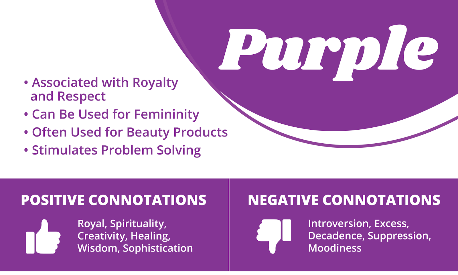
Purple is a regal color that is sensitive and understanding. When you see purple you may get the feelings of creativity, spirituality, romance, and mystery.
History shows that the color purple has been the color of superiority and royalty. Which leads many brands to use it to come off as more high-end and prestigious.
Lighter tints of purple can also be associated with femininity. Because of this, you will often see purple in beauty and anti-aging products.
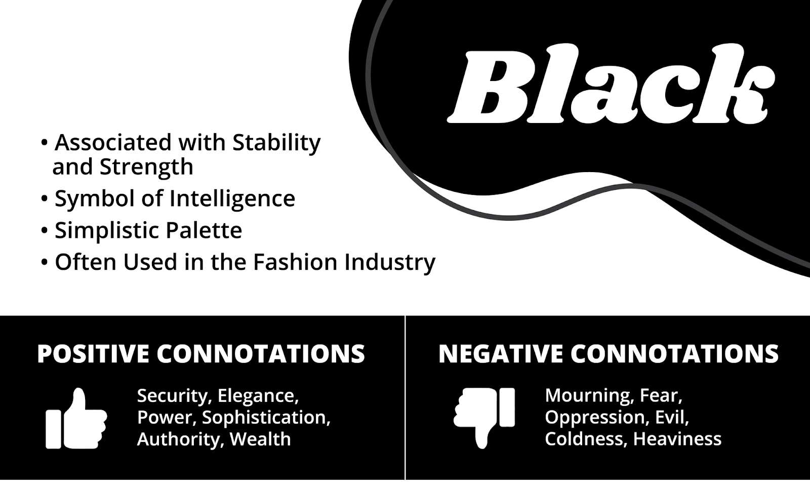
Black is a powerful color that is associated with luxury, power, and authority. It may give you a feeling of confidence and seriousness.
You will see black used in brands that hold more of a luxurious and high-end status. These brands usually use the simple black and white template to come off as clean and sophisticated. Take Chanel and other high-end fashion brands for example. Most of them use black and clean branding to give them that elite, luxurious status. Same with beauty brands, they will use black in packaging as well to feel elegant and formal.
You will also see black in tech companies as well. Tech companies use black in branding and even packaging to show the intelligence and sleekness of the products. They can also add a pop of color to add energy and excitement to the products they are promoting.

White is a very important part of most color schemes. It is diverse where it can work as simple as a background to an accent color. Without white many graphics would be overwhelming and maybe not work as well.
White can represent cleanliness, innocence, and peace but can also represent being impersonal, dull, and cold.
It offers a brand and graphics with more of a modern look and feel. Like black, you will also see white in many higher-end products. For example: Apple, Sony, Tesla, and Prada all use white for their branding. This allows them to come off as clean and sleek to the consumer.
White can add a lot of versatility to any brand, product, or graphics. It can be simple and effective at the same time but if used poorly it could look lazy and lack personality.
If you want to learn more about color psychology, I recommend visiting this article.
Need a hand with figuring out what to do with your brand’s colors? We’re here to help!

Author Info
Hi there! My name is Sidney Meyers and I am one of the Graphic Designers here at Systemax. I am responsible for creating artwork, anywhere from logos to social media graphics, to fulfill the needs and goals of a variety of different clients. Outside of work, you can most likely find me hanging out with friends, planning my next weekend adventure, or creating projects on my Cricut!